
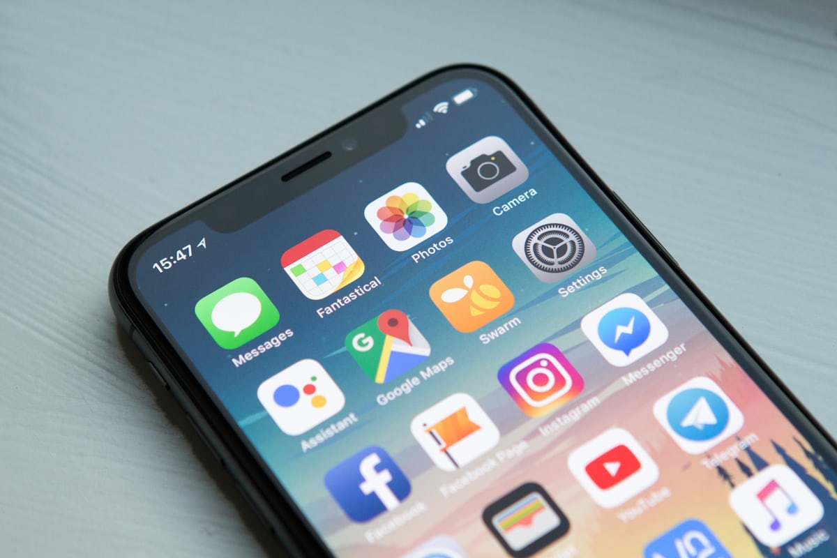
There was a time when building a website for desktop and treating mobile as an afterthought was perfectly defensible. That time has passed. Today, smartphones account for the majority of global search traffic, and Google's evaluation of any website begins with its mobile version — full stop. If that version falls short, the rankings follow it down, regardless of how polished the desktop experience might be.
This guide unpacks what mobile SEO actually involves in 2026, why it carries so much weight in both rankings and revenue, and what practical steps make the biggest difference for businesses that want to stop leaving organic traffic on the table.
What Mobile SEO Actually Covers
Mobile SEO is the discipline of making sure a website performs at its best when accessed on a smartphone or tablet. That sounds simple, but it touches almost every layer of how a site is built and maintained — from how quickly pages load on a 4G connection to whether a button is large enough to tap without accidentally hitting the link beside it.
At a technical level, mobile SEO revolves around a few core principles: a responsive design that reflows content to fit any screen width, pages that load fast even on constrained mobile networks, content and navigation sized for thumbs rather than mice, and structured data and meta tags that communicate clearly to search engines reading the mobile version of the page.
| Component | What It Covers | Why It Matters |
|---|---|---|
| Responsive Design | Layout that adapts to any screen size | Consistent experience, single codebase to maintain |
| Page Speed | Load time on mobile networks | Direct ranking signal and conversion driver |
| Mobile Usability | Tap targets, font sizes, navigation | Reduces bounce, increases engagement |
| Structured Data | Schema markup for mobile search features | Enables rich results in mobile SERPs |
| Core Web Vitals | LCP, CLS, INP measured on mobile | Google uses these as ranking factors |
Since Google switched to mobile-first indexing, the mobile version of a page is no longer just a secondary consideration — it is the version that determines where a site ranks. A flawless desktop experience paired with a slow or broken mobile experience will still produce poor rankings, because Google is not looking at the desktop version to make that call.
Mobile SEO vs. Desktop SEO: Where They Diverge
Mobile and desktop SEO share the same foundational signals — quality content, earned backlinks, crawlable architecture, and clear relevance to search intent. What separates them is how those signals are expressed and weighted when the user is holding a phone rather than sitting at a desk.
| Factor | Mobile SEO | Desktop SEO |
|---|---|---|
| Search Intent | Immediate answers, local queries, "near me" searches | Deeper research, longer-form content consumption |
| Layout Needs | Single-column, large tap targets, minimal clutter | Multi-column, richer visual design, denser navigation |
| Speed Expectations | Under 3 seconds — non-negotiable | Users tolerate marginally longer load times |
| Local Signals | Critical — location, GPS, "near me" queries dominant | Present but less central to intent |
| SERP Features | Maps, click-to-call, app packs, voice results | Featured snippets, knowledge panels, shopping ads |
| Content Length | Concise, scannable, bullet-heavy | Long-form performs well for research queries |
Understanding these differences matters because optimising for one environment while neglecting the other produces gaps. A long, detailed article that works beautifully as a desktop resource may frustrate a mobile visitor who can't scan it quickly on a small screen. Formatting and structure choices that feel invisible on a laptop become friction on a phone.
Mobile users typically make faster decisions and carry stronger local intent. A visitor searching "SEO agency near me" on their phone is further along the buying journey than someone browsing agency comparison articles on a desktop — and your mobile experience is the first impression that either earns or loses that conversion.
Mobile Search Behaviour InsightHow to Improve Mobile SEO: What Actually Moves the Needle
Mobile SEO improvements tend to fall into three buckets: technical changes that affect how the site loads and renders, content and structural choices that shape the experience once a visitor arrives, and local optimisations that connect the site to nearby searchers. The most effective programmes address all three simultaneously rather than treating them as sequential phases.
Commit to Responsive Design
A responsive site serves the same HTML to every device and lets CSS handle the layout reflow. This approach keeps maintenance simple — one codebase, one content set — while ensuring every screen size receives a coherent experience. Separate mobile subdomains (m.example.com) create synchronisation headaches that responsive design avoids entirely. Google also explicitly recommends responsive design as the preferred mobile configuration.
Treat Page Speed as a Non-Negotiable
Mobile visitors on cellular connections are less forgiving than desktop users on broadband. Compressing images using modern formats like WebP, deferring non-critical JavaScript, using a content delivery network to serve assets from nearby servers, and eliminating render-blocking resources are the levers that consistently produce the largest speed gains. Google's Core Web Vitals — particularly Largest Contentful Paint and Interaction to Next Paint — tie directly to both rankings and conversion rates.
Design for Thumbs, Not Cursors
Navigation menus, buttons, and links that work intuitively with a mouse pointer often fail under a thumb. Tap targets should be large enough to activate cleanly, links should have breathing room between them, and critical actions should sit within easy reach of the thumb's natural zone rather than buried in a corner. Font sizes below 16px create reading friction that increases bounce rates, especially on small screens.
Optimise for Local Search Signals
Local intent dominates mobile search. Claiming and fully completing a Google Business Profile, embedding location-specific keywords naturally within content, and adding schema markup for address, phone number, and business hours all strengthen the local signals that surface a site in map packs and "near me" results. Mobile users acting on local searches convert at substantially higher rates than those doing general research.
Eliminate Common Mobile Usability Errors
Intrusive interstitials — pop-ups that cover the main content immediately on load — are a confirmed negative ranking signal on mobile, and they damage user experience before visitors even see the content they came for. Images and videos that overflow their containers, incorrect viewport meta tag settings, and horizontal scrolling caused by fixed-width elements are equally damaging and often caught with a simple mobile usability audit in Google Search Console.
Shape Content for Mobile Consumption
Content that reads well on a large monitor can feel like a wall of text on a phone. Breaking paragraphs into shorter units, leading with the most important information rather than building to it, using subheadings as visual anchors, and keeping sentences direct all improve readability on small screens without compromising the depth or authority of the content. Meta titles and descriptions also display differently on mobile SERPs, so keeping titles under 60 characters and descriptions action-oriented ensures they display correctly and drive clicks.
Mobile App SEO: A Separate but Related Discipline
For businesses that operate a mobile app alongside their website, app visibility carries its own set of optimisation principles. App Store Optimisation shapes whether the app surfaces when users search inside the App Store or Google Play — keyword placement in the app title, description, and category all play a role in that visibility, much as on-page factors do in web SEO.
| Strategy | What It Does |
|---|---|
| App Store Optimisation (ASO) | Improves discoverability within app stores using keyword-rich titles and descriptions |
| Deep Linking | Connects specific app screens to web pages, making app content indexable by Google |
| User Reviews and Ratings | Positive reviews signal quality to both store algorithms and prospective users |
| App Load Performance | Slow-loading apps see higher uninstall rates and lower store rankings |
| App Install Campaigns | Paid campaigns combined with strong ASO produce the best cost-per-install |
Deep linking — connecting specific app screens directly to corresponding web pages — deserves particular attention, because it allows Google to index app content alongside web content, extending the reach of search visibility beyond the browser. For businesses where the app is the primary product experience, this connection between app and web SEO can meaningfully expand organic reach.
The Benefits of Getting Mobile SEO Right
Investing in mobile SEO is not simply about satisfying a Google requirement. The downstream effects touch every metric that matters to a business operating online — visibility, engagement, conversion, and long-term competitive position.
When Mobile SEO Stalls — and How to Diagnose It
Not every mobile SEO investment delivers visible results on schedule, and understanding why is as important as knowing what to do in the first place. The most common culprits are issues that are invisible during desktop testing but glaring on an actual device: images that don't scale, JavaScript that blocks rendering on slower connections, viewport settings that force horizontal scrolling, or content that is technically present but practically unreadable on a small screen.
Google Search Console's mobile usability report is usually the best starting point for diagnosis — it flags specific errors, affected URLs, and in many cases the exact element causing the problem. Running Lighthouse on representative pages reveals Core Web Vitals scores and prioritises which fixes will have the largest ranking impact. And testing on real devices, not just browser emulators, frequently surfaces issues that automated tools miss entirely.
Beyond technical issues, mobile SEO can underperform when the content itself isn't calibrated for mobile intent. A page targeting a high-volume keyword but structured for leisurely desktop reading may rank, but it will lose mobile visitors quickly — and that behavioural signal eventually softens the ranking. Aligning content structure and format with how mobile users actually consume information is part of the optimisation, not an aesthetic nicety.
Handled consistently, mobile SEO stops feeling like a compliance exercise and starts functioning as a genuine growth lever — one that compounds as the mobile-dominated search landscape continues to reward sites that meet users where they actually are.
Frequently Asked Questions
Mobile SEO is the process of optimising a website so that it performs well on smartphones and tablets — covering page speed, responsive layout, navigation clarity, and content readability on smaller screens.
More than 60 percent of global internet traffic now originates from mobile devices, and Google evaluates the mobile version of a site first when determining search rankings. A poorly optimised mobile experience directly hurts visibility and revenue.
Mobile SEO prioritises speed, simplified layouts, thumb-friendly navigation, and local intent signals. Desktop SEO can accommodate richer page designs and users with more time for detailed research, but both share the same foundational ranking signals.
Technical fixes such as speed improvements and viewport corrections can show ranking changes within weeks. Broader improvements to content and authority typically take three to six months to reflect meaningfully in organic traffic.